A Newly Inspired Brand

When we launched Spire almost a year ago, we set out with the intent to serve what we feel is a neglected community – the designers of the world who are as invested in chasing modern design trends as well as what it means to know Christ. We started with a simple question – what if we viewed that pursuit as the same race?
We desired to be signal-makers towards this inspiration, to offer others an opportunity and to call a community to interact and engage in an ongoing response. To say that this has happened is an understatement. But just as we have been blessed with much growth, we also realize the need to turn back to one of our ongoing principles: stewardship.
As our team, contributors, community and reach has grown, we realized that we needed to spend more time developing our own identity, both visually and holistically– ironic, given that most of our team spends the day setting the tone and visuals for so many other brands. Doubly ironic in that we would neglect to refine ours for so long.
Much like many long standing brands that have become iconic over the years, we never believed the original mark would be our final statement, we honestly just needed something to get out of the gates. And in a very cliché manner, what began as quick concept and temporary tool became something that our community felt had long standing aesthetic appeal. And so, for the last month, Spire has been engaged in the refinement and updating or our own brand and mark and we are happy to peel back the curtain and reveal where we’ve landed!
The Beacon
It began with taking a look at the original metaphor – simply said, the beacon has and always will be Jesus Christ, our savior, calling and Lord. This metaphor stood out to us in our original connecting and is still the personification of our namesake – our goal is to be a signal that draws others to hear the message of grace in our creativity.
We began by looking a the visual languages of signals and one in particular stood out to us: Morse.

When we drew from the visual language of morse code, our intent was to leverage a language that existed as an alphabet of audible signals, yet also have standalone strength as a visual set.
By spelling out “spire” in morse, you actually get a natural, declining pattern made up of a translated series of dots and lines (or more commonly referred to in morse as long and short signal bursts).

Next, we slightly modified the alignment of the baselines for each “letter”. Following that, we combined the bursts of each letter to form more stable and solidified illustrations as opposed to bits and pieces. In many ways, the nature of each letter signal still retains its original burst and feeling. Finally, we angled the drawing upwards, referencing Christ as our true North. If you compare the newer sketch to the original, you’ll see that it bears similarity, yet has been cleaned up and refined with a stronger purpose and intent behind each line.

The last Morse code letter in “Spire” has also become the dot above the “i”, acting as an exclamation mark of sorts when trademark and workmark combine to form our new brandmark: the beacon.


Also as tertiary reads, each part of the new trademark bears a metaphor to Christ’s love for us – His birth and life as one of us, His death on the Cross as he bore our sins and ultimately His return to Heaven.

Curate, Moderate, Instigate, Create
These textures each represent a portion of our core values as a community. To help graphic designers discover, understand, and acknowledge their purpose and creative calling through cultivating the intersection between servanthood and design. Each texture attempts to pull from the overall identity while expanding and evolving the language for use across our various platforms and media vehicles.
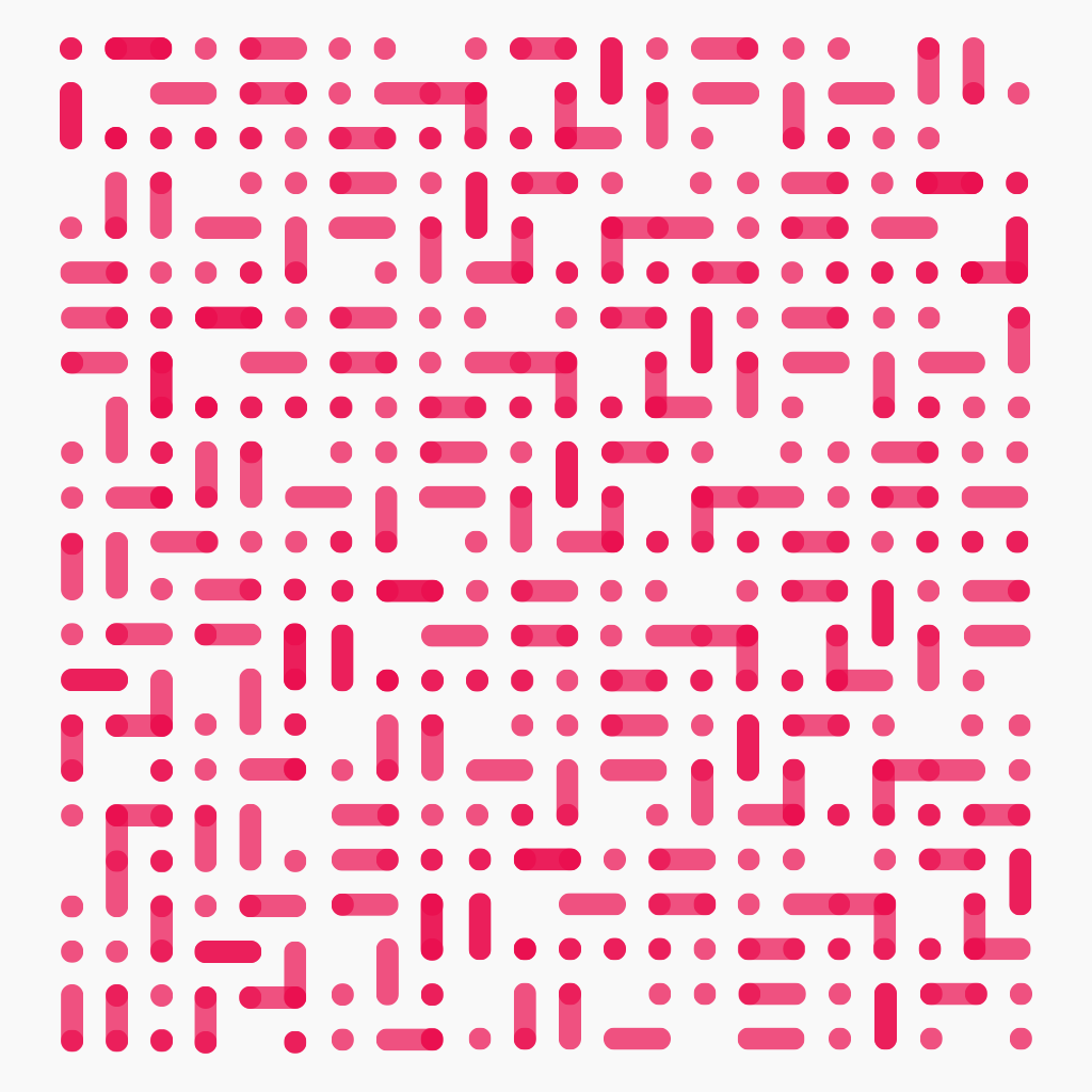
Our Story
The last texture is actually formed from the words, “Christ”, “resurrection” and “calling” written in Morse code and used as a repeating motif. This texture represents the culmination of our identity, a body of creatives that recognizes the value in coming together to combine individual strengths, perspectives, and hopes to better understand and communicate our calling to a world in need.


